The 6 squares pages are actually (6) 3-1/8" x 3" (again wonky sizes. The way I survived these pages was creating a template in Photoshop where I clipped my pictures to squares/rectangles I created in the sizes that matched these pockets. so I would fill them up and they looked normal. I did a lot of combining squares to make one large photo, I just like how it looks. (personal preference and it allowed me to capture the entire team). The cut file on the left is a Karla Dudley word stacked cut, from The Silhouette Store (here). The FCA#1 I just created via the Silhouette software.
(I covered up the faces that are not my child, and are close enough to make them out - the fuzzier group photos I felt were ok).
The Amazing divider is all pieces from the Theresa Collins"Hello My name is" collection, rub-ons, the bingo card, brads, etc... the heart cut file is from Just Jaimee storyteller collection (2014), and the word "amazing" is a Wilna Furstenburg design freebie from her Art Class 2.
The full page LO is just a again a combo of kit papers, elements and paint splatters. The Win ticket was created in design studio with a ticket cut and "bebas" font.
Below left is how simple some of the cards were - just using the papers from the kit and a few brads. (yes that is a long day at comp for both Sam & dad). The card on the right uses a little more product, a cut file from Just Jaime (and the 2 hearts from the cut file above) Add some journaling, and page is done. I love pocket pages for this album. It makes assembling so easy (if the pockets were a normal size I would be in heaven, sigh...).


"Live your story" I created in Design studio, and the on the right is a square right out of the kit papers. (There were days where the creativity just wasn't happening - thank goodness for a good kit).
I added this page because I wanted to remind ya how great it is to just use a social media clip..
And a tip on the photos. At first I thought this book had to be all about Sammy. But in reality it is a memory book for her about her team. I am so glad I had taken all the other team shots, so I could incorporate everyone in the book.
Another hint, there were many dividers and cards I wanted to toss out - but there a little patience and creativity can save them. This was one of them, and in the end I loved how it turned out.
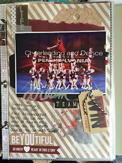
Sorry the team is "vellumed" out, but this is just a page added in - random size, team photo from one of the comps. The page is less than 6.5" x 9", and I hole punched and added it in the book. I love the randomness of the sizes of the pages scattered in the book.

Above is another 6-pack of photos, and a close up of the square. Not that it is anything amazing, but just layers of scraps, ticket die cuts, staples, washi, whatever I had to create a square to break up the busy photos and keep with the color theme of the book. below left is a again a quick tag created from cut files and the kit,
I am going to close today with a few pages from an away comp in Atlantic City, NJ. The travel comps I added more pages to include the rest of the trip and things we did, places we ate, etc....
The number file I cant locate where it came from - I think it is from The-lilypad's Memory Pocket Monthly kits. but I am not positive. I deleted it from my Silhouette library, so I can not locate it.
I love the tweet with the location map. for the away trip. I always try to add maps where I can to my pockets. And black and white is also a great tip to ease up the busy-ness of the pages. I actually put two 3x4 photos for this 4x6 pocket - no rules - so why not?
The next pockets included a photo of the tickets for the weekend, and a layered tag. and below is a pocket card from the kit with a QR code of the routine I found someone posted on you tube. I love QR codes, what a great way to add motion to a scrapbook!

I know most of the next page (above right) is covered faces, but I just wanted t stress the importance of team photos and fun antics/photo shoots in between routines. There is so much down time, but it seems these girls are always up for photo ops!
Below is a 2-page spread of the downtime of the comp. I got to mix in some more pocket sizes, and still throw in some traditional lay-out looks. All cards and papers and elements came from the kit collection, minus the letters - they are simple stories.


Last page for today is a team pic and the kit is from a Gossamer blue kit - I think the chipboard is from the "I am" collection. Some more ink splatters, and the perfect ending of a weekend trip. Tomorrow I will share the last few comps and a few more pages.
**I am not affiliated in any way with any of the designers, I found cuts that I liked that represented cheering and the kits that matched the colors I needed.


No comments:
Post a Comment